CoolTool Blog

How To Do Usability and UX Testing for Mobile App
Mobile app development is the fastest-growing segment in the mobile industry. Every respected company already has an app or is planning to design it. Before dreaming about million revenue it's extremely important to ensure the good usability of the newly-developed software.
Usability testing helps to improve CRO by finding users' intents and wishes, making a decision on fixing some badly performing parts of a website or app and developing additional functionality. With usability testing for a website that is conducted on PC all is already understood. But when it comes to usability testing for the mobile app there are some difficulties. How to do usability tests on mobile?
Besides the application of proper technologies, which will be covered in the second part of this article, it’s very important to properly prepare for the test. Such preparation includes the development of the logic of the test and a lot of work with users. At least, you should explain to them what, how and why you are going to test. Let’s take a closer look at how you prepare an effective usability test and which technologies it’s better to use in order to get qualitative behavioral insights and feedback from users.
But before we start…
Usability Testing VS User Experience Testing - what’s the difference?
Usability testing and User Experience testing (UX) are two different methods of testing. And we need to understand their basics.
Usability is the way of how a product can be used by users to reach specified goals. Usability testing is aimed to uncover how much the product (app, website) is easy to use, understandable, is it able to satisfy the users needs effectively.
User Experience is a user’s perceptions of the product (app, website). User Experience testing includes measuring users’ emotions, gaze movements, preferences, and all key details of behavior during and after use the product.
In order to succeed with your product, you should pay attention to both usability testing and UX testing.
Who are your testers?
The more precise criteria you use for the identification of your target audience, the better. Age, occupation, education, cultural and religious backgrounds, geography, computer literacy, and many other factors can be used to identify a group of users you want to target in your test. The audience should be relevant to the tested product. For example, if you are testing a car-sharing app, elderly car owners in rural locations might not be your target audience while millennials working in creative industries and living in big urban settings may fit better.
According to a number of recent studies, we recommend inviting you to participate in qualitative research - 5 people, for quantitative - 20, for eye-tracking, and facial coding - 40. If you have enough time and resources to conduct testing, you can invite more people. The bigger the sample size, the more precise are the results and the higher are chances to identify minor interface issues which prevent users from effective interaction with it.
How to set the tasks for testers?
Clear objectives lead to clear and measurable results. It means that in order to see how users interact with the application you need to ask them to perform particular tasks. You can’t just ask them to download the application and start using it. In this case, their experience will be too unpredictable and chaotic to be measured effectively. A task, set within a usability test, should be precise, actionable and shouldn’t contain any hints, which can facilitate its performance (and thus distort the results of the test by imposing certain logic of behavior on users).
- Precise. If you are testing an application that helps to find accommodation, set a clear task for a user - for example: “find a hotel room in the downtown of X city for two persons under 100 USD per night” and see how users will interact with the application. The precision is important in such tests since users download applications to perform certain actions and if programs don’t deliver what they are expected to, users delete them. So, set concrete tasks and watch how users perform them in order to see which bottlenecks and stumbling blocks they come across in the process.
- Actionable. Quite often, while conducting usability tests, companies ask users to describe how to perform a certain action. This approach may be relevant in some cases, but it’s recommended to ask users to do a certain action instead of describing it. The thing is that while describing the experience users tend to be less precise and are more prone to make up things, compared to when they are actually going through the experience.
- Raw. Don’t provide users with directions, suggestions or any other help which can facilitate the completion of the task. Such hints prevent you from understanding how users interact with an app. Furthermore, by providing them guidance you won’t be able to track their unique user experience since they will just follow your instructions instead of finding their own ways to “communicate” with an app.
And don’t forget about the report. Usability tests, like any other similar exercises, should result in reporting which contains all major highlights of the process, as well as recommendations on how to bridge identified gaps. All the insights you’ve defined should be transformed into particular tasks for designers and developers.
What you need for the usability/user experience testing
Standard usability testing is aimed at understanding whether the app/website is user-friendly for the target audience. Results of tests are then transformed into insights that serve as guidance for the UX designer on how to improve the usability of the website or applications. If done properly, the testing allows to substantially increase the leads’ conversion.
Though, in the contemporary digital world, classic tools such as surveys are not sufficient to get in-depth usability insights. To receive such insights and effectively increase CRO you need to apply contemporary technologies, such as eye-tracking, emotions measurement, mouse tracking, etc.

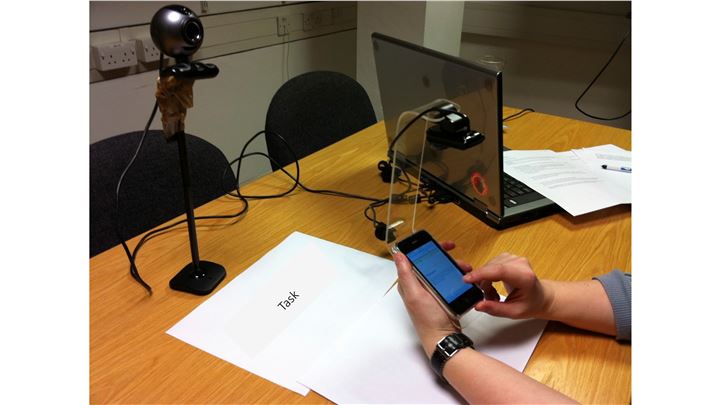
Until recently, it was difficult to test mobile versions of websites and mobile apps. They were tested with the help of usability labs which had several disadvantages – they were bulky, expensive and required a lot of time for setting up. A standard usability lab included two webcams one of which was fixed over a smartphone and tracked users interaction with the website/application interface, while the second one was in front of his/her face to register eye movements, emotions, etc.
Even the abovementioned description of the testing process sounds confusing, so you can imagine what kind of a nightmare it was to analyze such diverse data. Nevertheless, thanks to the fast development of neuromarketing software in recent years, several user-friendly comprehensive testing solutions appeared on the market, such as Apperian, Loop11, App experience, Swrve, Appsee, Leanplum, etc. These solutions not only decreased the time and investments required for conducting tests but also improved the quality of insights.
By the way, we at CoolTool have launched UXReality – a solution that will make the testing of mobile applications as easy, fast, and comprehensive as never before. This technology has recently won the prestigious The Marketing Technology Award 2019 as the best conversion rate optimization solution. UXReality uses the front camera of your smartphone in order to register the eye movement and emotions of users while they interact with the interface. After that, the obtained data is analyzed and transformed into actionable insights. It turns your smartphone into a full-fledged usability testing lab which allows you to see the users’ interaction with the interface of the website or app through their eyes.

